On This Page
GRRM
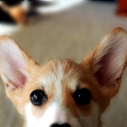
Adding a badge is also very simple and can easily be customized, as can be seen in this example.
You can also combine the avatar component with the Dropdown component to open a menu when it or the badge are clicked. For this you also have to deactivate the default Dropdown Menu button styles by setting the btnStyle="".
src
:
string
=
''
Set the image source.
alt
:
string
=
'avatar'
Set the image alt value.
text
:
string
=
''
Set the text value in case you don't have an image. The string automatically gets shortened to 4 characters. If you pass in separate words it will use the first letters of each word.
delayMs
:
number
=
0
The amount of time in milliseconds to wait before displaying the image.
size
:
string
=
'w-16 h-16'
Set the width and height of the avatar.
rounded
:
string
=
'rounded-btn'
Set the rounded shape.
borderStyle
:
string
=
'border-2 border-surface-500-800'
Set the border styles.
background
:
string
=
'bg-primary-500'
Set the background color, for when the text is being shown. Has no effect for when an image is being shown.
textStyles
:
string
=
'font-bold text-on-primary'
Set the text styles.